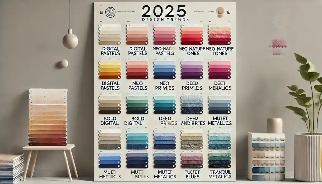
As we look ahead to 2025, it’s clear that color trends will continue to evolve in fascinating ways, reflecting our connection to technology, nature, and emotional well-being. The emerging color palettes are expected to balance digital vibrancy with soothing, grounded tones. From calming pastels with a digital edge to rich, earthy hues that connect us to nature, these are the colors that are set to make an impact in design next year. Let’s explore each trend in depth and see how they can be applied across various creative projects.
Digital Pastels: Soothing Yet Futuristic
One of the standouts for 2025 will be digital pastels. Imagine soft lavender, mint, and pale peach tones, but with a subtle glow that makes them feel a bit futuristic. These colors take the gentle quality of traditional pastels and give them a digital twist, creating a soothing effect without sacrificing a modern edge. In design, digital pastels bridge the gap between our love for technology and our need for calm. They’re perfect for websites, user interfaces, and branding that want to convey a fresh, contemporary feel without overwhelming the viewer. Think of them as colors that are both easy on the eyes and quietly engaging—ideal for environments that blend warmth with tech sophistication.
Neo-Nature Tones: Earthy Shades That Connect Us to the Planet
As sustainability becomes an even bigger focus, it’s no surprise that earthy tones will be a dominant trend in 2025. Neo-nature tones like muted greens, deep browns, and soft clay colors evoke a sense of grounding and mindfulness, making them popular for eco-conscious brands. These colors go beyond the typical natural palette by bringing a contemporary twist; they’re more refined, less raw, and almost reminiscent of clay or organic minerals. Using these tones in branding, wellness products, or interior design projects taps into people’s desire to reconnect with nature. They make us feel more rooted and aligned with our surroundings, ideal for creating a brand image that speaks to environmental responsibility and modern living.
Bold Digital Primaries: A Nod to Retro Futurism
Vibrant, primary-inspired colors like electric blue, cyber red, and high-energy yellow will add a bold touch to design in 2025. These colors bring a sense of retro-futurism—think of the digital age aesthetics mixed with a playful hint of nostalgia. They’re the colors you’ll see in tech-forward spaces, gaming, and digital art, where high saturation and strong contrast add energy. Using bold primaries is a great way to grab attention, especially on digital screens where colors like these pop. For designers looking to inject a bit of tech-inspired fun, these colors will be ideal for social media graphics, website buttons, or advertising campaigns that need to stand out instantly.
Deep Reds and Berry Tones: Moody, Rich, and Luxurious
In contrast to the digital brights, rich, deep reds and berry tones are poised to bring a sense of sophistication and warmth to 2025. These colors—ranging from burgundy to plum and berry—offer a moody elegance that’s perfect for luxury branding, fashion, and interiors. They evoke a sense of warmth and are inherently dramatic, making them ideal for designs that want to convey passion or depth. Berry tones feel like the perfect blend of modern and classic, lending a timeless quality to everything from high-end packaging to fashion editorials. For brands looking to create a sense of intimacy and richness, deep reds and berries will be a go-to palette.
Muted Metallics: Subtle Sheen Without the Shine
Muted metallics like soft golds, pewter, and brushed bronze add a sophisticated touch to designs without the flashy feel of traditional metallics. In 2025, these colors are expected to be used as elegant accents that bring understated luxury to a design. They’re especially suited to minimalist aesthetics where subtlety is key. Rather than drawing attention through shine, these metallics exude a calm glow that suggests refinement. In product packaging, interior accents, or high-end branding, muted metallics are perfect for designers who want to create an air of sophistication and durability. They work well in both digital and print formats, adding depth and texture in a way that’s timeless yet distinctly modern.
Tranquil Blues and Aquas: Refreshing and Calming
Lastly, tranquil blues and aqua tones will bring a refreshing calmness to the 2025 palette. These shades—reminiscent of oceans, skies, and fresh water—tap into the theme of well-being and serenity. Light aquas, teal, and sky blue evoke a sense of peace, making them ideal for wellness brands, lifestyle websites, and health-related designs. They remind viewers of the ocean’s calming effect and offer a clean, clear look that’s inviting. These colors are perfect for designs that want to promote relaxation or create a clean aesthetic, such as health apps, spas, and lifestyle brands. When used in digital spaces, tranquil blues have a brightening effect without feeling overly cold, offering a sense of refreshment and renewal.
Bringing It All Together
The color trends for 2025 reflect a blend of nature and technology, from earthy neo-nature tones to tech-driven digital pastels and bold primaries. Together, these palettes offer endless possibilities for creative projects, allowing designers to capture the essence of modern life—where technology coexists with our desire for calm, balance, and a connection to the environment. Whether you’re designing for digital media, packaging, or interiors, incorporating these colors thoughtfully can help you stay on-trend and convey the values that resonate most with today’s audiences.
