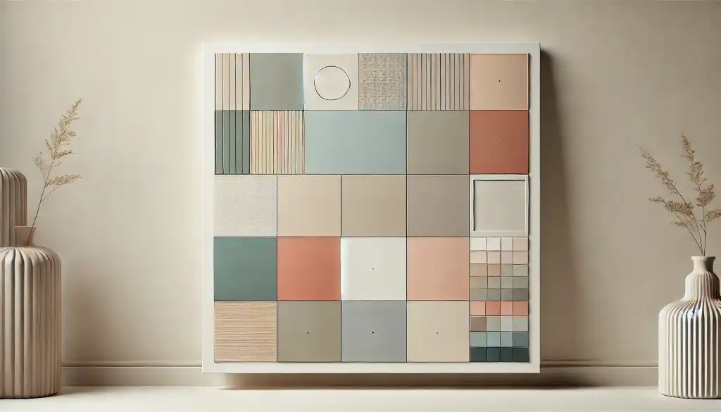
Minimalism isn’t just about simplicity; it’s about finding beauty in restraint. In the world of color, minimalism translates to clean, understated palettes that focus on subtlety and harmony. With its popularity across digital design, branding, and interior decor, minimalist color usage helps convey clarity, elegance, and modernity. But how do you build a minimalist palette that avoids feeling flat or monotonous? In this article, we’ll explore the principles of minimalist color design, the types of colors that work best, and some practical tips for creating your own subtle, modern palettes.
The Principles of Minimalist Color Design
Minimalism in color is all about intentionality. Instead of using a wide array of colors, minimalist palettes typically limit themselves to two to four hues. By paring down to a few well-chosen shades, designers can create a focused, refined look that feels sophisticated and balanced.
In minimalist color design:
Less is More: Fewer colors can create a greater impact. Minimalist palettes use just enough variation to add depth without distraction.
Emphasis on Neutrality: Minimalist colors lean toward neutrals—whites, grays, and blacks—accented by soft, natural tones like muted beige, blush, or sage green.
Tone and Texture over Color Variety: Depth is achieved through variations in tone and texture rather than numerous colors, allowing a minimalist palette to maintain visual interest without overwhelming the viewer.
Minimalism relies on the concept of “silent colors,” where colors act as a backdrop to enhance the simplicity of a composition rather than draw attention.
Choosing Colors for a Minimalist Palette
Minimalist palettes favor colors that blend rather than contrast sharply. Here are some classic color families and shades that fit well with minimalist design:
Neutrals: Whites, grays, and blacks form the base. Variations in these colors, from warm off-whites to charcoal grays, can be used to create dimension.
Earthy Tones: Soft, nature-inspired colors like stone gray, sand beige, or clay provide warmth while staying grounded and understated.
Muted Pastels: Minimalism doesn’t exclude color entirely—light pastel tones like dusty pink, sage green, and pale blue can add softness without being overpowering.
Soft Monochromes: Monochromatic palettes in shades of a single color—such as various grays or blues—add subtlety without straying from the minimalist aesthetic.
When crafting a minimalist palette, consider the effect of temperature and tint. Warmer neutrals and muted earth tones evoke a sense of calm and approachability, while cooler tones like light grays and soft blues add an air of quiet sophistication.
Practical Tips for Building a Minimalist Color Palette
1. Start with a Neutral Foundation
A neutral foundation—such as off-white, light gray, or beige—sets the tone for a minimalist color scheme. By grounding the palette in a neutral base, you’ll create a clean canvas that allows any additional colors to be introduced with subtlety and intent. For instance, pairing warm gray with an accent of sage green or blush pink can bring a sense of softness and calm to a design.
2. Use Accents Sparingly
In minimalist design, less is truly more, and that applies to accent colors. Limit your palette to one or two accents to maintain a clean and uncluttered look. Accent colors can be introduced through small elements like icons, buttons, or background highlights to create focal points without overpowering the composition.
3. Opt for Muted Variants of Traditional Colors
Muted colors are the hallmark of minimalist design. Instead of bright primary colors, look for softer alternatives—think olive green instead of bright green or dusty blue instead of royal blue. Muted colors maintain harmony, keeping the palette cohesive and gentle on the eyes.
4. Focus on Shades, Tints, and Textures
To avoid flatness in minimalist palettes, use variations in shades and tints rather than adding new colors. For example, a monochromatic palette of soft gray can use darker and lighter shades to create depth. In web and digital design, adding subtle gradients or using textures like soft shadows and overlays can enhance the palette’s depth without straying from minimalism.
5. Embrace Negative Space
Minimalism is as much about the absence of color as it is about its presence. White or negative space provides breathing room, making the colors in a minimalist palette feel intentional and impactful. Negative space also prevents colors from feeling too heavy or confined, allowing the design to maintain a light, airy quality.
Examples of Minimalist Color Palettes
Modern Neutral Palette
- Base: Warm beige (#F5F5DC)
- Accent: Charcoal gray (#333333)
- Subtle Contrast: Soft olive (#A9A9A9)
Soft Monochrome Palette
- Base: Light gray (#D3D3D3)
- Mid-Tone: Slate gray (#708090)
- Dark Accent: Charcoal (#2F4F4F)
Earthy Pastel Palette
- Base: Off-white (#FAF9F6)
- Accent: Dusty sage (#BCC9B0)
- Subtle Contrast: Muted clay (#D8B5A5)
These palettes keep the color selection simple, relying on shades that complement each other seamlessly without disrupting the minimalist feel.
Minimalism Across Applications: Where Subtlety Shines
Minimalist color schemes are popular across many design fields:
Web Design: Minimalist colors keep interfaces intuitive and approachable, ideal for clean, user-focused designs.
Branding: Minimalist palettes can convey sophistication, making them suitable for luxury brands, wellness products, or eco-friendly companies that want to reflect simplicity.
Interior Design: Minimalist colors in home decor, such as neutral grays and soft earth tones, create a peaceful environment, balancing aesthetics with calm functionality.
Minimalism in color is all about intentional restraint and mindful selection. By building a palette that’s subtle yet impactful, you can create a design that feels both modern and timeless. Whether you’re working on a website, brand identity, or an interior space, minimalist colors provide a versatile foundation for achieving elegance and clarity without clutter. Embrace the power of simplicity, and let your colors quietly make a statement.
